Colours are something that brings liveliness to all objects. Similarly, colours play a major role in catching the attention of a human being towards your business. Entrepreneurs usually do not realize the importance of colours and due to weak colour combinations fail to get the attention that they require from the virtual audience.
The perfect colour scheme not only generates heavy traffic on your website but also reflects your business in the most optimistic manner. Each colour contains a hidden meaning and so one must follow certain tips to ensure that they create user interactivity with the right colour combination.
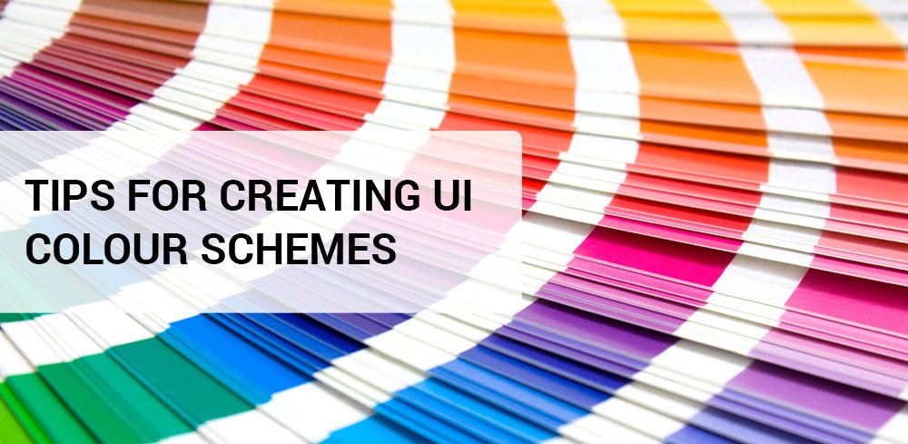
Understanding the Psychology of Colours
There are various hues across us like blue, red, violet, yellow, green, etc each contributing towards the creation of a perfect work environment in their own way. As I have mentioned before, each colour holds significance and so it is important to understand the psychology of hues before deciding on the final colour combination to be used for different purposes.
Majority of us must be aware of the fact that red, blue and yellow are the primary colours that generate various other secondary hues like green, violet, orange, etc. Apart from these, there are several other types of colours like accent, neutral and semantic. Accent colours are used for emphasis, neutral colours include black and white. Semantic colours include an arrangement of colours in a logical sequence.
Bright colours like red, yellow, orange, pink, and so on, reflect positivity, passion, courage, strength, sensitivity and feminism. On the other hand, cool colours like blue, green, violet, etc, stands for royalty, prosperity, spirituality and luxury. The core hues like white and black are most popularly used contrast colours as these portray royalty and modesty.
What is the Right Colour Scheme?
We often come across several web pages that appear dull as they use the same colour over and over again. For example, several websites use orange, yellow and red together in their websites that look unattractive. One must always use the contrast of two colours while finalizing the combination. Colour contrast does not always mean white and black only. It can be either red and blue or green and yellow. The colour scheme should be used in such a manner that the viewers can connect with the web page and can realize its significance in just one go. Besides this, always ensure that the same colours are not used in excessive amount.
I have shared my views regarding the perfect UI colour scheme but if you feel that I have missed out on something essential then you are free to comment below. Also please comment whether my article was helpful or not.

Graphic designing is something that requires dedication and enthusiasm along with creativity. Withholding all the three qualities, Sonam Tyagi is one of the exceptional graphic designers who always create something that appeals the viewers in a single go. She also has a strong liking towards music and dance.